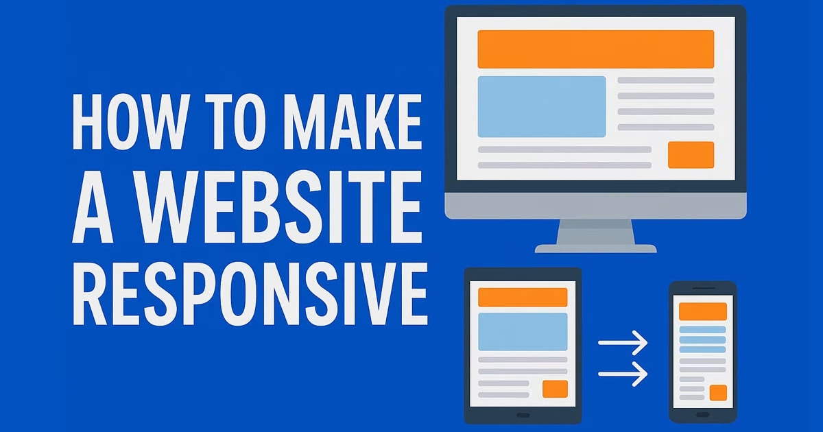
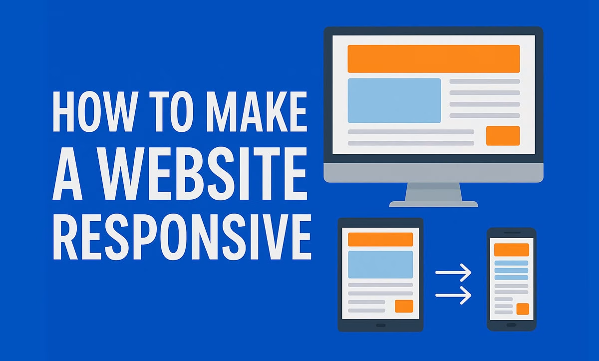
PART 1: Creating a Responsive Website with WordPress, Elementor, and Royal Elementor Kit
Step 1: Install WordPress
- Choose a hosting provider that offers one-click WordPress installation (e.g., Hostinger, Bluehost, SiteGround)
- Log in to your hosting control panel and click on “Install WordPress”
- Fill in the installation details: site name, admin username, password, and email
- After installation, log in to your WordPress dashboard at:
yourdomain.com/wp-admin
Step 2: Install the Royal Elementor Kit Theme
- In your WordPress dashboard, go to Appearance > Themes > Add New
- Search for:
Royal Elementor Kit - Click Install, then click Activate
Step 3: Install the Elementor Plugin
- Navigate to Plugins > Add New
- Search for:
Elementor Website Builder - Click Install and then Activate
Step 4: Import a Pre-Made Demo Template
- Go to Appearance > Import Demo Data
- Browse and select from various ready-to-use demo sites (portfolio, business, restaurant, blog, etc.)
- Click on Import Demo
- Wait for the import process to complete—this will include pages, images, and responsive layout settings
Step 5: Customize Your Website with Elementor
- Go to Pages > All Pages and select a page to edit
- Click Edit with Elementor
- Use the bottom-left device icons (Desktop, Tablet, Mobile) to preview and customize responsiveness
- Adjust the layout for each device:
- Resize fonts
- Modify column widths
- Show or hide elements per device
Step 6: Publish Your Website
- Click Update in Elementor to save changes
- Visit your website and test it on various devices
Pro Tip: Press F12 in your browser and use the responsive mode to simulate smartphones and tablets.
PART 2: Building a Responsive Website Using HTML, CSS Media Queries, and Bootstrap
Step 1: Set Up Basic HTML Structure
Create a file named index.html and add the following code:
<!DOCTYPE html>
<html lang="en">
<head>
  <meta charset="UTF-8">
  <meta name="viewport" content="width=device-width, initial-scale=1.0">
  <title>Responsive Website</title>
  <link href="https://cdn.jsdelivr.net/npm/bootstrap@5.3.0/dist/css/bootstrap.min.css" rel="stylesheet">
  <link rel="stylesheet" href="style.css">
</head>
<body>
  <div class="container">
    <div class="row">
      <div class="col-12 col-md-6">
        <h1>Hello, World!</h1>
      </div>
      <div class="col-12 col-md-6">
        <p>This is a responsive layout using Bootstrap.</p>
      </div>
    </div>
  </div>
</body>
</html>
Step 2: Add Custom CSS with Media Queries
Create a file named style.css with the following content:
/* Base style for mobile */
body {
  font-family: Arial, sans-serif;
  font-size: 16px;
  background-color: white;
  padding: 20px;
}

/* Tablet breakpoint */
@media (min-width: 768px) {
  body {
    font-size: 18px;
    background-color: #f8f8f8;
  }
}

/* Desktop breakpoint */
@media (min-width: 1200px) {
  body {
    font-size: 20px;
    background-color: #e0e0e0;
  }
}
Step 3: Test Responsiveness on Devices
- Save
index.htmlandstyle.cssin the same folder - Open
index.htmlin your web browser - Press F12 and toggle device toolbar to test responsiveness

